


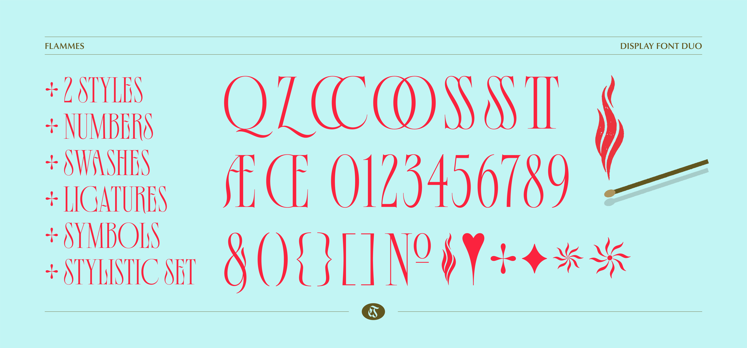
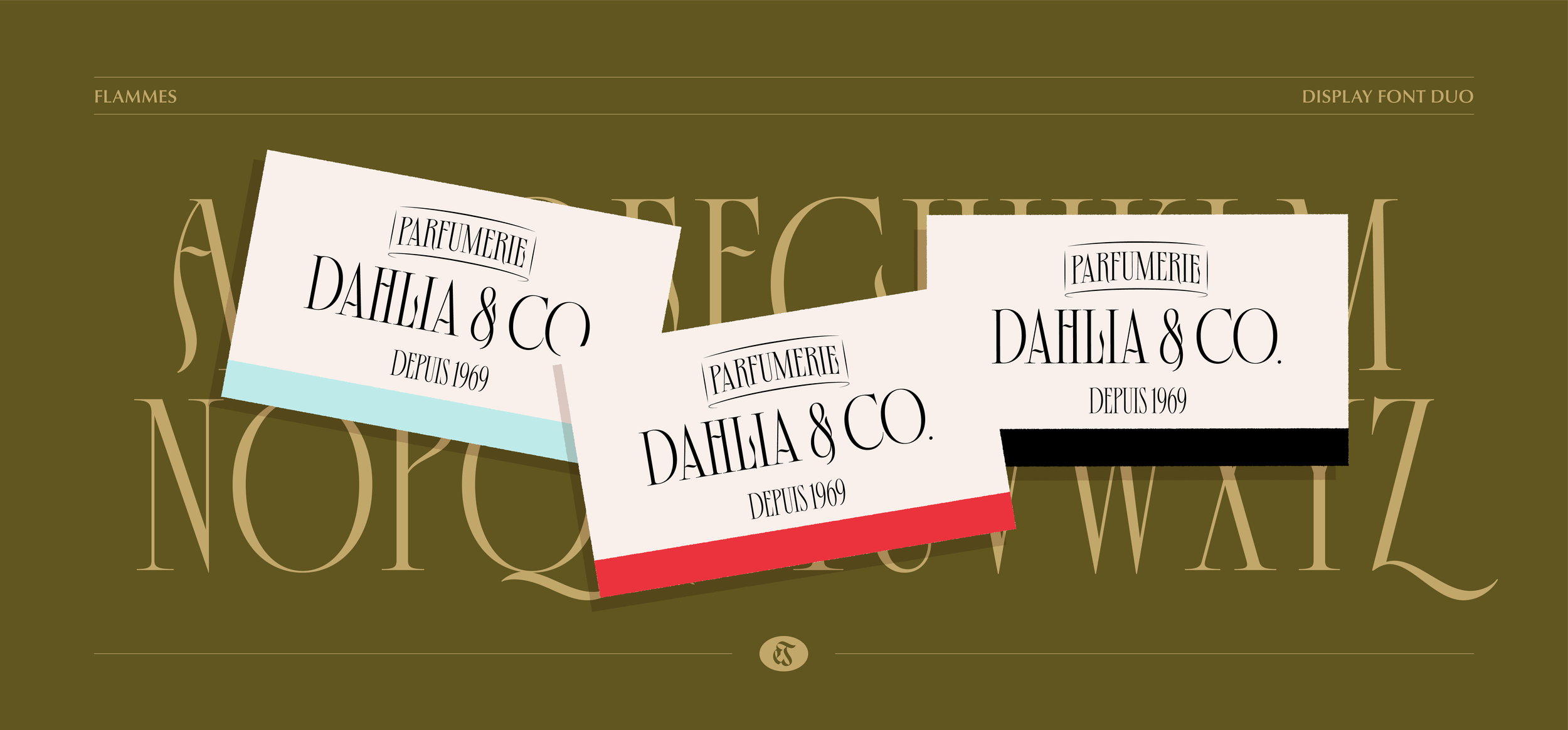
FONT DUO - Flammes
REGULAR & GRIT TEXTURE
✦ Flammes est un duo de fonte au style énigmatique, flamboyant et élégant. Elle comprend deux versions, Regular & Grit (texturé). Idéale pour les titres et textes grands formats, elle apporte une identité forte et une texture handmade.
➺ Contacter moi ici pour toutes questions et acheter pour 4 utilisateurs et +.
➺ Partager vos projets via Instagram @eva.jerome.design et #evajerometype.
➺ Collaborer avec moi sur des projets ici.
✦ Flammes is a font duo with a mysterious, fiery, and elegant style. It comes in two versions, Regular & Grit (textured). Ideal for titles and large text, it provides a bold, subtle identity and a handcrafted feel.
➺ Reach out here if you have any questions and to purchase for 4+ users.
➺ Share your work via @eva.jerome.design and #evajerometype on Instagram.
➺ Collaborate on a project with me here.
Le fichier inclu:
• 1 Fonte Flammes - Regular (.OTF);
• 1 Fonte Flammes - Grit (.OTF);
• 1 Licence EULA - pour 3 utilisateurs (licence d’utilisation);
• 1 Specimen de la fonte complète.
The file includes:
• 1 Font flammes - Regular (.OTF);
• 1 Font flammes - Grit (.OTF);
• 1 License EULA - for 3 users (End-User License Agreement);
• 1 Specimen of the complete font duo.
TÉMOIGNAGES / TESTIMONIES
“ J'ai beaucoup aimé travailler avec cette typographie. Je cherchais une fonte qui soit à la fois élégante, fine mais qui s'impose quand même dans une mise en page contemporaine. De plus, le fait de pouvoir avoir deux styles et des symboles illustrés, offre une richesse créative à mes compositions de mise en page. ”
— Heing
Illustratrice
“ It has been a joy to be able to test “Flammes”, from seeing the individual characters on Eva's Instagram to experiencing the interpretation of the typographic forms together in this elegant display font. Lively and condensed letters, like fire, “Flammes” is a typographic option suitable for editorial as well as digital projects. ”
— Jota Jota
Graphic Designer
“ I love the typography, as much as in its anatomy, the details and the way you present the specimen. The second option (which has something like a grit) is beautiful, this finish gives it a nice touch between the organic and the elegant (and the Flames concept suits it very well). ”
— Jean Carlos García
Director de Arte | Tipógrafo & letrista